|
|
|||||||
 |
|
|
Thread Tools | Search this Thread | Display Modes |
 27th February 2012, 10:37 PM
|
#1 |
|
Member
Join Date: Aug 2006
Posts: 608
|
Following a suggestion by Spiral - and IMO a wonderful suggestion of that - I would like to dedicate a thread to exploring the earliest use of sans serif fonts by English cutlers...
Unfortunately, edged weapon collecting is not impervious to the banalities of human nature. We tend to become entrenched in complacency with our acceptance of the status quo and complacent in our desire to challenge it. As a result, myths abound in this field, and myths and mistakes alike, when repeated enough, unfortunately become accepted as "fact." One such example that comes to mind is with regards to the erroneous labeling of the Collins No. 18 machete as a "V-44 fighting knife." Just google "V-44 fighting knife," and you'll receive a ton of these in return:  In fact, go to any gun or knife show, and if you ask for a "V-44 fighting knife," this is what they will sell you. Because we collectors all know that is what it is, right? Wrong. The V-44 was a round-tip, blunt-nose machete that was included in flight kits. The V-44 was not a clip-point Bowie profile machete issued to and carried by Marines in the Pacific Theater in WWII; that was the No. 18 machete made originally by Collins. But that hasn't stopped author after author, dealer after dealer, and collector after collector repeating this ad infinitum until it became accepted as "fact." It is my opinion a similar issue exists with the perception that if a knife is stamped in a sans serif font, it must date to the late 19th century. It is my opinion this is equally wrong. There are plenty of documented examples that provide evidence that cutlers were using sans serif typefaces in their stamps during the mid-19th century. By establishing an accurate date for the first appearance and use of such stamps, it will help us better assess, understand, and appreciate the knives we collectors both have and will doubtlessly encounter in our quest to add examples to our respective collections. Nor is the benefit of such an effort limited to edged weapons. In the thread in which this discussion was initiated (see here), the authenticity of what appears to be a beautiful late-18th or early 19th century blunderbuss was called into question in no small part due to the use of a sans-serif font. In the following posts, I hope to show that a) the commercial use of such a font in England dates not to the late 1800's but rather to the early 1800's, and b) there are plenty of examples establishing the use of sans serif stamps by English cutlers by the mid-19th century. Last edited by laEspadaAncha; 28th February 2012 at 03:15 AM. Reason: To write a proper introductory post to the topic |

|

|
|
27th February 2012, 10:43 PM
|
#2 | |
|
Member
Join Date: Dec 2004
Posts: 1,712
|
Quote:
 Spiral |
|
|
|
|
|
28th February 2012, 01:46 AM
|
#3 |
|
Member
Join Date: Aug 2006
Posts: 608
|
Okay... as an antecedent to the discussion, we must first establish a timeline for the appearance and the use of the sans-serif font. Once again, sans serif fonts are those which lack the little extensions, or "serifs," otherwise present at the end of the strokes of (Latin) letters.
Fortunately, there is a nice and tidy compilation of historical documentation from which such an establishment is nothing other than a formality. Here we see a partial print from a document entitled "Design for a British Senate House" which was exhibited at the Royal Academy in London in 1779:  According to typologist James Mosely, the origin of the sans-serif font dates to the Classical Revival period that began in the 18th century, and he cites its first known appearance in England as early as 1748, in Stourhead (see here). From his same typographic journal, he states the font was appearing in print media by 1805, in European Magazine, a London-based publication. As per Mosely, the Ordnance Survey, the government institution charged with domestic cartographic functions, began using copperplate engravings with sans-serif letters in 1816, establishing the adaptation of a sans-serif font by the government of the United Kingdom well within the first quarter of the 19th century. 1816 also saw the first production of a sans-serif printing type, by William Carlson IV, which he produced in his own foundry (see here). However, he referred to his font by a different name, and another fourteen years would elapse before another founder (Figgins) first used the term "Sans Serif" to describe the font which had already been in use commercially for well over a decade. Therefore, it is established the sans serif font not only existed, but was in use in England as early as the mid-18th century, and by 1816, founders were commercially producing a sans-serif typeface. Any claim that the font didn't come into use until after 1870 is historically inaccurate and demonstrably false. It is thus entirely reasonable to consider that this typeface was used by English cutlers long before 1870. In my next post, I will post several examples of knives dating to the mid-19th century that clearly show the use of a sans-serif font in the stamps present on their blades. Last edited by laEspadaAncha; 28th February 2012 at 04:08 AM. |
|
|
|
|
28th February 2012, 04:55 AM
|
#4 |
|
Member
Join Date: Dec 2004
Location: NC, U.S.A.
Posts: 2,229
|
Sorry, coming in a little late on this one, but when you say 'sans serif' font, are you referring to block-type lettering on weapons vs cursive style? If so, there are multitudes of examples from the late-18th with said font. If I am mis-interpreting the question, please ignore my comments.
Specifically, early (ca 1805) swords with block letter "GR", the markings of Wooley swords, Dawes swords circa 1790-1800 period. 
|
|
|
|
|
28th February 2012, 05:12 AM
|
#5 |
|
Member
Join Date: Aug 2006
Posts: 608
|
Hi Mark,
Sans serif doesn't just refer to block-type lettering (as opposed to cursive), but more specifically, to block-type lettering that is absent the little 'feet' you find at the end of each stroke on each character (called 'serifs'). In the image below, the word "ALPHA" appears in a serif font in the image below, while both the trademark on the left (with the heart & pistol) and the caption underneath are written in sans serif fonts:  With that in mind, what is the earliest example you have seen of an English knife that is stamped with a sans serif font?  Regards, Chris |
|
|
|
|
28th February 2012, 09:26 AM
|
#6 |
|
Member
Join Date: Dec 2004
Posts: 1,712
|
Excelent post Chris!
I obviously agree sans serif existed in print much earlier,probably any English libary will have reference books that include some sans serif before c.1870 My point is so far theres no reliable dated evidence of the use of sans serif on bladed weapons before that date. The examples you post in the other thread are highly dubius to say the least. Mark serifs are the small curls or flats added to the tops & bottoms of some font. Spiral The examples listed by Chris. for further study. {Some hotlinked as originaly posted in the blunderbuss thread.} Strangly {img} tags dont work on the ones actualy posted on viking sword, how does one link to those I wonder? 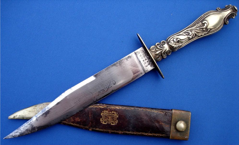  
|
|
|
|
|
28th February 2012, 04:54 PM
|
#7 | |
|
Member
Join Date: Aug 2006
Posts: 608
|
Quote:
Hi Jonathan, Thank you for the complement and the encouragement, and thank you as well for attaching the images of the aforementioned Edward Barnes & Sons knives. Before we revisit the three knives above - which I maintain are authentic - I would like to go ahead and nip this misconception in the bud, so to speak... I have had the good fortunate to know several knife makers well-known in the knife maker & collector community, including someone who shaped custom blades for one of the better known American knife makers before setting out on his own several decades ago. Whenever I have a question about a vintage factory or custom knife, I turn to him. However, in the world of antique blades, there are comparably few authorities one can turn to, but at the top of a very short list, two names come to mind: Levine and Flayderman. If is from the latter's treatise on the Bowie knife, titled simply, The Bowie Knife, that this next exmaple appears. This knife, a 19th-century folder, is significant and relevant to this discussion for two reasons: First, the use of a sans serif font on the reverse of the blade. Second, the knife is made by George Woodhead. George Woodhead was a Sheffield cutler who opened his shop in partnership with Hartley in 1841. And while he - and later his son - continued to produce knives for the American market through 1884, by 1849 he had bought out his partner and stamped all his knives "G. Woodhead," and from 1876 to 1884, "G. Woodhead & Son." Fortunately, this progression of ownership and the marks employed during each stage allows us to define the window of time during which a marked example was made. The ricasso on this knife is stamped, "Woodhead and Hartley," which definitively - and conclusively - dates this early folder to between 1841 and 1849. Thus, it is self-evident that Sheffield cutlers were using a sans serif font well before the "accepted" time. Now, given the plethora of Sheffield cutlers, if one cutler was known to use this font ca. 1850 - over 30 years after the first commercial sans serif dye stamp was produced by a foundry, it should be reasonable to expect we would find other makers (e.g., Edward Barnes & Sons) employing the use of the font as well. But before we revisit the knives Spiral reposted above, I will demonstrate further evidence by presenting not one, but three other Sheffield makers (not inclusive of Edward Barnes) who similarly used sans serif fonts on their blades during the mid-19th century. |
|
|
|
|
|
29th February 2012, 05:36 PM
|
#8 |
|
Member
Join Date: Aug 2006
Posts: 608
|
This next example is a knife of fine quality that comes from the same collection as the first, and like the first, was published in the book The Bowie Knife, by Norm Flayderman.
He dates this particular knife to having been made between 1847 and 1849, presumably due to the etching on the reverse, which has an inscription commemorating the (U.S.) victory at the Battle of Buena Vista (by the early 1850s, Mexican-American War-themed inscriptions had been replaced by Gold Rush, abolitionist, and secessionist themes). Made by and marked to Sheffield cutler C. Barnes (relation to Edward Barnes unknown). Not only does the inscription appear in a sans serif font, but the ricasso is stamped with the maker's mark in which the last line "SHEFFIELD" is clearly stamped in a sans serif font as well: |
|
|
|
|
1st March 2012, 03:35 AM
|
#9 |
|
Arms Historian
Join Date: Dec 2004
Location: Route 66
Posts: 10,860
|
Chris and Spiral thank you both so much for taking this intriguing topic out of the other thread, and placing it with its own. I must say I really like this constructive and team oriented move which is proving a valuable look into this otherwise subtle nuance of markings.
With the interesting perspective you have both shown, I am curious just how much variation might have been in place with both styles of font in contemporary use. It would seem that in many cases long established makers might have used older forms longer, and possibly more modern and industrialized style prevailed in those regions where this was more prevalent. Also, I am wondering just how much metalworking stamps would follow the character of printed material, for example the use of the long or medial 'S' which looked like an 'f' in this context. Obviously the use of majescule letters would be presumed for stamping, while perhaps the cursive script so often used in markings in the 18th century would have favored the print characters. .. or did it? Excellent topic guys!!!! Thank you again. All the best, Jim |
|
|
|
|
20th August 2012, 07:10 PM
|
#10 |
|
Member
Join Date: Nov 2010
Posts: 129
|
Just looked through my images of edge tools from the UK (mainly billhooks) - the serif name stamps were still being used into the 20th century, especailly on tools made by small village makers. However most large industrial makers (e.g. Brades or Elwell) had been using non-serif stamps from the late 19th century. Cutlers, however, used much smaller stamps than edge tool makers, and the serif would a) be very small and b) easily damaged, so it would make sense to use non-serif lettering for small stamps...
|
|
|
|
|
|
|


 Linear Mode

